For Making Your Documents Braille-Ready.
To enhance interaction with Microsoft Word for Windows, DBT supplies the SWIFT add-in and the BANA Template, both of which help to make transcribers' lives easier when working with Word.
If you are part of a team that prepares documents for braille, you might wish to print this topic out and pass it round to colleagues. Generally speaking, it will not cause extra work. In fact, it might help them to use Word more efficiently.
Here are 10 helpful tips for making a Word document which both looks good and makes good Braille (as well as Large Print).
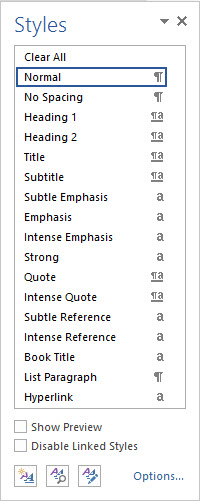
All the Styles you need are set up in Word already: many Heading Styles all the way from Heading 1 on down, Normal for your body text, Index Styles, Table of Contents Styles, List Styles; these are all available in the Normal template. If you use these Styles, a Word document will translate into quite reasonably-formatted Braille.
When you use Styles, you have the added benefit that when you want to change the font, size or emphasis of a Heading, you only need to change the Style once - your changes are then applied automatically to every occurrence of that Style in the document.

A Header Style is used for the document header. This is a piece of text that is repeated at the top of every page; it is not a Heading! For Document, Chapter and Paragraph headings, you need a Heading Style. If you use a Header Style in the body of a document, Duxbury will not import it!
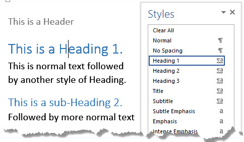
The picture shows part of a Word document showing both a Header and a Heading: the Heading is part of the body text, while the Header is in a box of its own. The Styles dialog to the right shows the two styles.

If you think you need a sub-heading, apply one of the lesser heading Styles; do not just embolden and change the font size when you're using Normal Style. That said, bold, underline and italics are fine for emphasis within a paragraph; they can be translated into the correct Braille code to emphasize the text.
This is a Heading which just "looks" like one!
The lines above show two visually identical-looking lines of text. However one has the Heading 1 Style applied, and the other is Normal Style text which has had the font size changed and Italics applied. They look the same, but only one will come into a Duxbury document as a proper Heading.
Keep your document plain, elegant and readable. Concentrate on content rather than looks. Keep to a single topic per paragraph, and resist the temptation to fill your document with fancy fonts, size changes, orientation changes and colours. It will not help your readers to understand, and it will be lost on the Braille readers - if in fact all the content can be brought into Duxbury in the first place.
And do not mistake pictures of text as real text! WordArt does not translate into Braille, even if it looks colourful on the printed page.
You can make a beautiful document using three Heading Styles and the Normal Style; this allows you four fonts and four colours, one for each Style.

A picture of the sentence "This is not Text" produced using WordArt.
If you must use images, diagrams, plots and graphs, and the information is crucial to all your readers, make sure that they can be rendered as tactile graphics - otherwise that information will be lost to Braille readers. If you are using the Word drawing and graphics tools, make sure that the image is saved into a separate file for rendering as a graphic, and that there is a note in the body text to alert the Braille reader to the graphic and its relevance.

Figure 1: Picture of Alignment buttons on the Word toolbar
You can add a note to an image easily by putting a descriptive line immediately underneath it: this might contain a Figure number that the braille reader can use to refer to the corresponding tactile graphic. In the example above, we have used a Text Box to contain the description. In this case, the Braille reader might not gain anything from having a tactile rendering of the image, but they should know it was there in the original.
Is a table really the only way to represent this information? They can be great visually, but a very complex table, or one with a lot of columns, can be impossible to render in Braille; the Braille page has, at most, half the carrying capacity of the print page. Try blowing your font size up to 22, and see how much of your table is visible.
If your table is too complex, can you split the information in some way? Can it be rendered in text instead?
Be careful also that you do not embed images into your tables; the information in them is lost to the Braille reader.

If you're using a text box to position text on the page, remember that you can do this with indent; this will look just as good, and will not cause such problems to the Braille transcriber.
If you're using the Text Box to mix graphics and text, it is actually an image you're making. How will the Braille reader access this information? Can it be rendered as a tactile diagram? Duxbury brings in text boxes, but at the point they are placed – which can cause confusion; make sure your Text Box is placed in the proper place in the text so that the information flows smoothly, and use some extra text to describe the graphical contents. You can include the descriptive text inside the Text Box, or - if you have to put the original text Box out of sequence - you can use another Text Box to refer to it by Figure number.

You should not need to use tabs at all; use styles instead, which will not do strange things to your Braille layout. Word has an in-built style called Normal Indent. It looks like this:
This paragraph is Normal Indent Style.
When this paragraph is imported into Duxbury, it will be treated as if it is formatted in Normal Style - it will not be indented in your Braille file. If you need more indents, set up some more Word Styles for larger indents; you do this by choosing Format, Styles and Formatting, and clicking New Style.

Base your new style on Normal, and then go to Modify, Paragraph and use the dialog box there to set the indents for your new Style:

If you must use tabs, only use the tab key once by setting the tab stop - do not press the tab key repeatedly, because it won’t be possible to accurately predict what will happen when it is translated to Braille.
For each Style you are using, select Format: Style and click the Modify button. In the Modify Style dialog box, select Format: Paragraph. Next, in the Spacing section, change the After box to 12 (or whatever spacing you want). This will eliminate the need to press the Enter key more than once between paragraphs, and will make the work of the Braille producer much easier.

This is the button to click to show you where all the extra line-breaks are. You only need one at the end of each paragraph; if you can see a column of them like this, your styles need a little work!

The way to begin the next part of your text on a new page is to enter a hard page break. You do this by pressing Control+Enter. Duxbury will not preserve this in your Braille document unless you set the Word Importer to do so. Generally, you will not want to preserve hard page breaks, unless you are beginning a new Chapter in a book.
So if you have another column of paragraph marks (remember the button to click?), backspace them into oblivion and press Control+Enter. You will then see a nice clean page break, Like this!

For help in earlier versions of Word, press F1 or go to the Help menu. When Help opens, search for Styles.